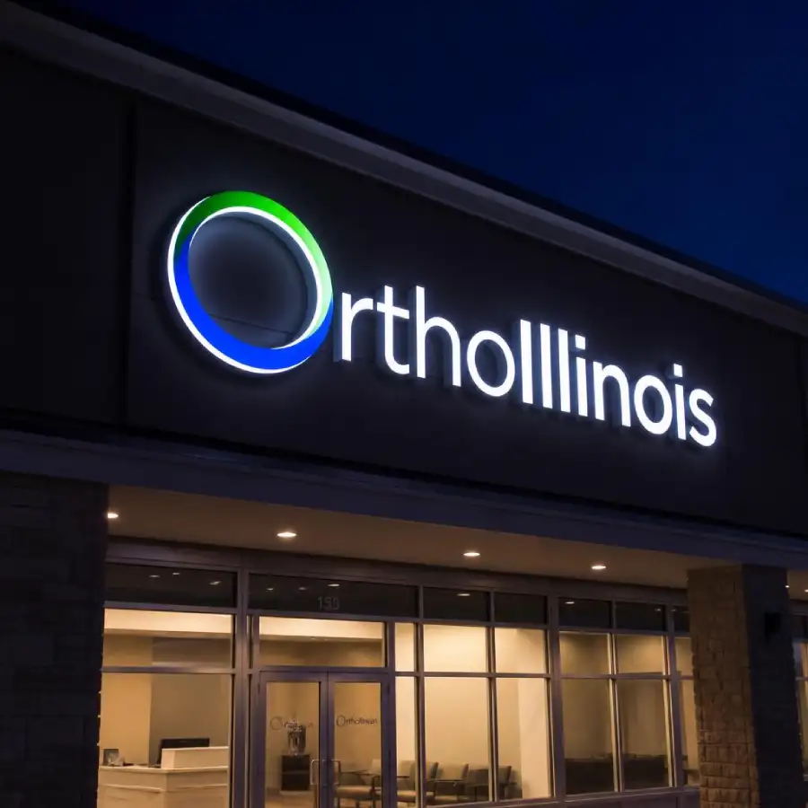
Color psychology in branding is the study of how specific colors trigger predictable emotional and behavioral responses, and businesses use it to shape how customers feel about them before a single word is read. Blue reads as trustworthy and stable, which is why it dominates finance and healthcare. Red reads as urgent and energetic, which is why it shows up on sale signage and fast-food branding. Getting this right across a building’s signage, interior, and vehicles is what makes a brand feel deliberate rather than accidental.
What Each Color Actually Communicates
Blue: Trust and Stability
Blue is the most common brand color across finance, healthcare, and technology because it reads as calm, competent, and reliable. It’s a safe default for any business that needs to project stability before it’s earned a customer’s trust through experience.
Red: Urgency and Energy
Red raises heart rate and reads as urgent, which is exactly why it appears on clearance signage, fast food branding, and anything meant to prompt an immediate decision. Used sparingly, it draws the eye; used everywhere, it can read as aggressive rather than energetic.
Green: Calm and Growth
Green is associated with health, growth, and environmental responsibility, which makes it a common choice for wellness businesses, outdoor brands, and any company wanting to signal sustainability.
Warm Tones: Hospitality and Approachability
Orange, warm yellow, and terracotta tones read as friendly and approachable, which is why they show up consistently in hospitality, food service, and family-oriented retail branding.
Purple: Luxury and Creativity
Purple reads as premium, creative, and a little unconventional, which is why it shows up in beauty, luxury goods, and brands trying to signal originality rather than mainstream reliability. It’s used less often in commercial signage than blue or red, which can work in a brand’s favor, standing out simply by being a color competitors in the same category aren’t using.
Black and Dark Tones: Authority and Premium Positioning
Black and other dark tones read as premium, serious, and authoritative, which is why they appear consistently in high-end retail, legal services, and any brand trying to project confidence rather than approachability. Dark tones also make accent colors, like a gold logo mark or a bright accent line, read as more premium by contrast, which is a common pairing in upscale building signage.
Why Consistency Matters More Than the Perfect Color
In our experience working with Pittsburgh businesses across renovations and rebrands, the businesses with the strongest brand recognition aren’t always the ones with the most theoretically perfect color choice, they’re the ones whose color shows up identically on the building exterior, the lobby, the vehicles, and the marketing materials. A slightly-off shade of blue that’s consistent everywhere reads stronger than a perfect blue that’s slightly different on the building sign than it is on the delivery van.
Consistency is also a maintenance question, not just a design one. Paint fades, vinyl ages, and vehicle wraps weather differently than an interior wall graphic exposed to indoor lighting, which means a brand color that was perfectly matched at installation can drift out of alignment across touchpoints within a few years if nobody is tracking it. Keeping a documented color specification, not just a visual memory of “our blue,” is what makes it possible to catch that drift before a customer does.
Applying Color to Physical Signage

Branded reception displays are usually the first physical touchpoint where color choice becomes concrete rather than theoretical, a lobby sign has to match the exact brand color under the building’s actual lighting, not the color as it appears on a screen. Getting a physical proof under real lighting conditions before final production is what prevents small but visible mismatches.
Color Across Interior Environments
Environmental wall graphics extend brand color beyond a single sign into the full space a customer or employee moves through a reception wall, a hallway accent, or a full mural. This is where color psychology has the most room to work, since it shapes the feel of an entire environment rather than a single point of contact.
Industry Color Conventions Worth Knowing
- Healthcare and finance: blue and other cool tones, signaling trust and competence
- Hospitality and food service: warm tones, signaling approachability and appetite
- Wellness and outdoor brands: green, signaling health and sustainability
- Retail and promotional signage: red used sparingly, signaling urgency without overwhelming the overall palette
Color on Vehicle Graphics and Moving Assets
Vehicle graphics are often the touchpoint where color consistency breaks down first, since a wrapped van or fleet vehicle is produced by a different process, and sometimes a different vendor, than a building’s exterior signage or interior branding. A color that matches perfectly on a printed building sign can read differently once it’s applied as a vinyl wrap under direct sunlight and constant weather exposure.
Because vehicles are also the most visible, most mobile representation of a brand, color mismatches here are more noticeable than almost anywhere else, a delivery van with a slightly-off shade of blue parked next to a building with the correct shade is an easy comparison for anyone to make. Producing vehicle graphics from the same brand color specification used on building and interior signage is the detail that prevents this.
Testing Color Before Full Production
Color always shifts somewhat between a screen, a printed proof, and a finished sign under real lighting, which is why a physical proof under the building’s actual lighting conditions is worth the extra step before committing to full production. Fluorescent lobby lighting, LED accent lighting, and natural daylight from windows all render the same color specification slightly differently, and a proof approved only on a monitor can produce a visible surprise once it’s mounted.
This is a small, low-cost step relative to the cost of discovering a mismatch after a full sign, vehicle wrap, or wall graphic has already been produced and installed.
When to Break From Convention
Industry color conventions are a strong starting point, not a rule. A healthcare brand that wants to read as approachable rather than clinical might deliberately choose warm tones over the expected blue, and a landscaping company might choose a bold, non-green palette specifically to stand out against every competitor using the same green-and-brown default. The associations described throughout this piece are what most customers expect, which makes them safe choices, but breaking from that expectation is itself a valid strategy when a brand has a specific reason to differentiate rather than blend in with category norms.
Frequently Asked Questions – Color Psychology in Branding
What does the color blue communicate in branding?
Blue communicates trust, stability, and competence, which is why it’s the dominant brand color across finance, healthcare, and technology industries.
Why is red used so often in retail signage?
Red raises visual urgency and prompts quicker decisions, which makes it effective for sale signage and promotional displays, though it should be used sparingly to avoid reading as aggressive.
How important is color consistency across different signage types?
Color consistency across a building’s exterior, interior, and vehicle signage is often more important to brand recognition than choosing a theoretically perfect single color, since mismatched shades across touchpoints weaken recall.
Do different industries have standard brand color conventions?
Yes. Finance and healthcare commonly use blue for trust, hospitality and food service use warm tones for approachability, and wellness or outdoor brands often use green for health and sustainability associations.
Why might my brand color look different on a physical sign than on screen?
Physical signage reflects actual building lighting and material finish, which can shift how a color appears compared to a digital screen. A physical proof under real lighting conditions helps confirm the color before full production.
Can Spark Signs match our existing brand colors across all our signage?
Yes. Spark Signs works from a business’s brand guidelines and color specifications to produce consistent signage across building exteriors, interiors, and vehicles, with a color proof provided for approval before production.