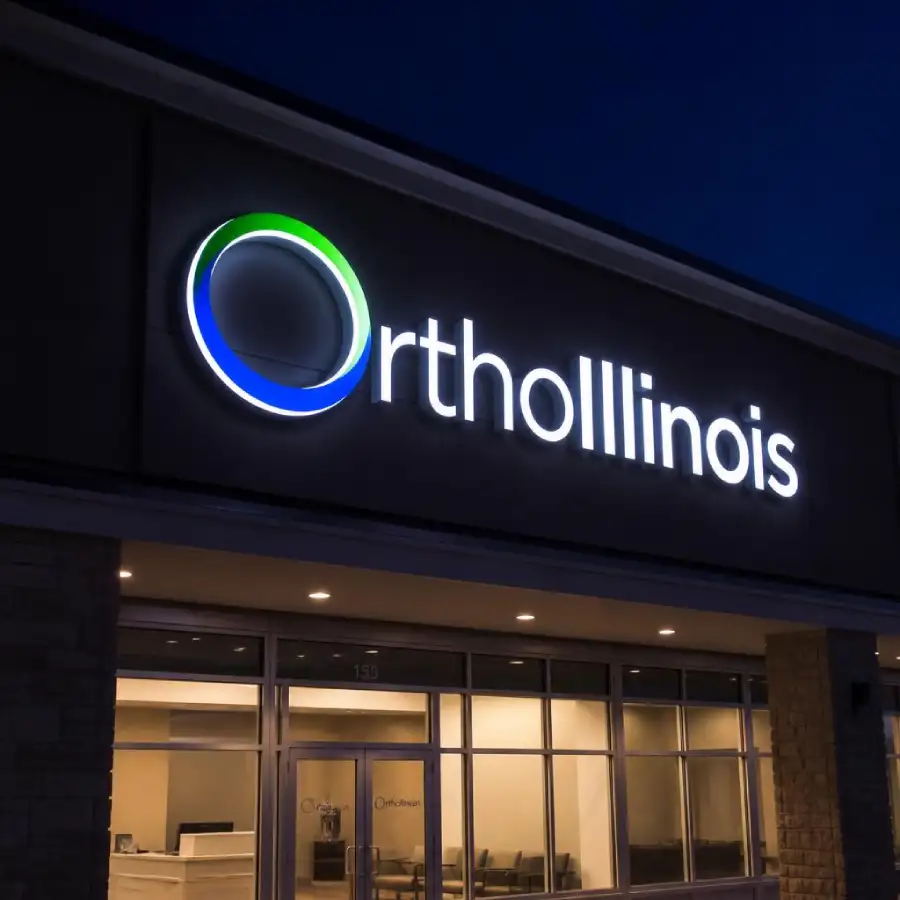
A patient’s opinion of a medical practice starts forming before a provider ever says a word. It starts in the parking lot, continues at the front door, solidifies at the reception desk, and either gets confirmed or contradicted by the time they reach the exam room. Good medical office branding ideas treat that entire path as one continuous experience, not a lobby project and a wayfinding project handled separately.
Medical office branding is the consistent use of a practice’s name, colors, and signage across every touchpoint a patient encounters, from the exterior building sign to the exam room door, so the physical space reinforces the same trust and professionalism the practice wants patients to feel. Done well, it reduces patient anxiety, cuts down on staff time spent giving directions, and makes a practice feel established even in a newly leased suite.
Why Consistency Matters More in Healthcare Than Almost Any Other Industry
Patients arrive at a medical office already carrying some level of stress. They may be anxious about a diagnosis, unfamiliar with the building, or juggling paperwork and insurance cards while trying to find the right suite. In our experience working with clinics and health systems across the region, the offices that feel calmest to patients are almost always the ones with the clearest, most consistent signage, not necessarily the ones with the newest furniture or the biggest waiting room.
Inconsistent branding creates small moments of doubt that add up. A patient who sees one logo treatment on the building sign, a slightly different one at the front desk, and no signage at all directing them to the correct hallway starts to wonder whether they are in the right place. That doubt is the opposite of what a healthcare brand needs a first-time patient to feel.
The Reception Area Sets the Tone
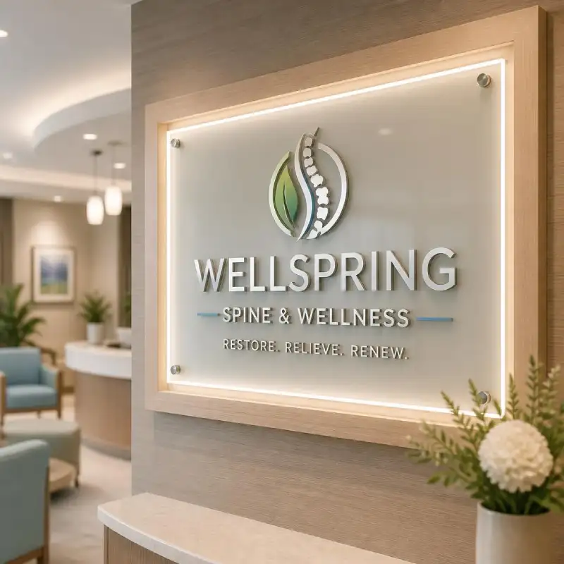
The reception desk is the first extended interaction a patient has with the practice, and it is usually the highest-impact single location for branding investment. A well-designed lobby sign does more than display a logo. It confirms to the patient that they found the right office, establishes the practice’s visual identity before a single conversation happens, and gives staff a professional backdrop that reinforces credibility during every check-in.
The best reception signage pairs the practice’s logo with clean, legible typography and enough contrast to read easily from across the room, since patients are often scanning for confirmation while still holding a phone, a bag, or a child’s hand. Materials matter here too. Dimensional letters or an illuminated lobby sign tend to read as more established than a printed vinyl decal, which matters in a specialty where patients are actively evaluating whether a provider looks credentialed and permanent.
Wayfinding: The Branding Patients Actually Use
Once past reception, branding shifts from an identity statement to a functional tool. Multi-provider practices, especially those sharing a building with other specialties, need clear directional signage that gets patients to the correct suite, exam room, or lab without relying on staff to repeat directions all day. This is where consistent color coding, directional arrows, and repeated logo placement do double duty: they reinforce the brand while solving a genuinely practical problem.
Exam room and hallway signage should carry the same color palette and typography as the reception area, not a simplified or generic version of it. When the visual language changes between the lobby and the hallway, patients subconsciously register a drop in polish, even if they cannot articulate why. Matching materials and finishes throughout, not just matching colors, keeps that consistency intact.
ADA Compliance Is Not Optional, and It Should Not Look Like an Afterthought
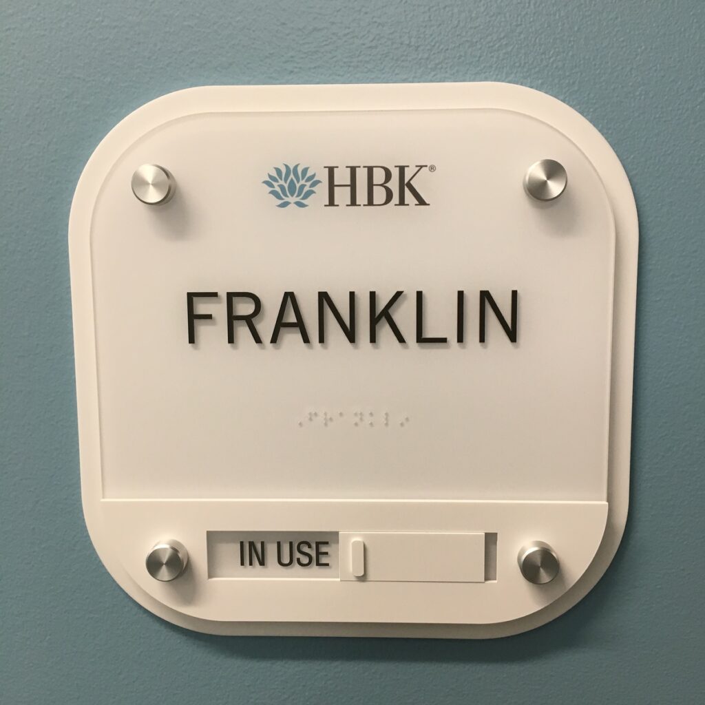
Every healthcare facility in the United States has to meet ADA signage requirements for exam room identification, restroom signage, and directional wayfinding, including specific rules for tactile lettering, Grade 2 Braille, mounting height, and contrast ratios. Too often, ADA compliance gets treated as a separate, purely functional requirement bolted onto the branding after the fact, resulting in generic plastic placards that clash with an otherwise cohesive design.
That approach is a missed opportunity. ADA-compliant room signage can be produced in a practice’s actual brand colors, with matching typography and finishes, so the compliant signage reads as an intentional part of the design rather than a regulatory patch. Practices that plan ADA signage alongside the rest of their branding from the start avoid a second round of signage later and present a more finished, professional space from day one.
Exam Room Identification Solves a Staffing Problem Too
Clear, consistent exam room numbering and signage is not only for patients. Front desk staff, nurses, and providers moving between rooms benefit from an unambiguous system that reduces confusion during busy periods. Color-coded hallway sections paired with large, legible room numbers cut down on the small inefficiencies that accumulate across a full day of patient visits, particularly in larger practices with a dozen or more exam rooms across multiple hallways.
Material choice reinforces this system further. Practices that use the same finish, whether brushed metal, acrylic, or a specific laminate, across exam room plaques, hallway directories, and department signage create a tactile sense of consistency that patients register even without consciously noticing it. Mixing finishes across sign types tends to make a practice feel assembled in pieces over time rather than designed as a whole, particularly in multi-specialty buildings where several practices share common hallways but each maintains its own suite identity.
What a Cohesive Rollout Actually Looks Like
We typically approach a full medical office branding project in three linked phases: an exterior and reception phase that establishes the primary identity, a wayfinding phase that carries that identity through hallways and directories, and an ADA compliance phase that folds required signage into the same color and material palette rather than treating it separately. Sequencing the work this way, rather than handling each phase in isolation, is what produces a space that feels like one cohesive practice instead of three separate signage vendors’ work stitched together.
The investment pays off in ways that go beyond appearance. Practices with clear, consistent branding report fewer front-desk interruptions for directions, smoother patient check-in, and, anecdotally, higher patient confidence during first visits, which matters in a healthcare setting where trust is established quickly or not at all.
None of this requires ripping out an existing space. Most practices we work with are updating signage inside a suite they have occupied for years, working around existing finishes, door hardware, and hallway layouts rather than starting from a blank shell. A well-planned signage rollout accounts for those constraints from the start, so the finished result reads as a deliberate, cohesive brand rather than a retrofit.
Frequently Asked Questions: Bringing Your Practice’s Brand Into the Exam Room
What is the most important place to start with medical office branding?
Reception and the front entrance are almost always the highest-priority starting point, since that is the first extended touchpoint where a patient forms an impression of the practice’s professionalism and confirms they are in the right place.
Does ADA signage have to look purely functional and generic?
No. ADA-compliant room signage can be produced in a practice’s brand colors and typography while still meeting required tactile lettering, Braille, contrast, and mounting height standards, which keeps the compliant signage visually consistent with the rest of the space.
How does wayfinding signage reduce staff workload?
Clear directional and room-identification signage means front desk and clinical staff spend less time giving verbal directions to patients moving between reception, exam rooms, and shared facilities like labs or restrooms.
Should every exam room match the reception area exactly?
The exam rooms should share the same color palette, typography, and material quality as reception, even if the specific sign type changes from a large lobby sign to a smaller door plaque, so the brand experience stays continuous throughout the visit.
Can existing signage be updated without a full office renovation?
Yes, many practices update reception and directional signage as a standalone project, without touching walls, flooring, or fixtures, since the signage itself carries most of the visible brand identity in a medical office.
How long does a full medical office signage rollout typically take?
Timelines vary with the number of exam rooms and hallways involved, but a phased approach covering reception, wayfinding, and ADA compliance is generally planned and installed within a few weeks once designs are finalized.