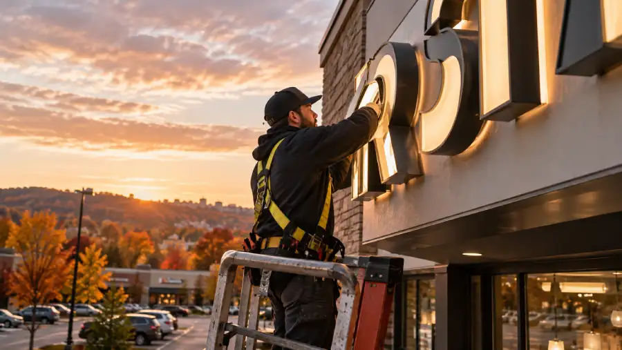
Most customers decide whether to pull into a business before they ever read a word on the building. A driver traveling 35 miles an hour has roughly three to five seconds to notice a storefront, judge whether it looks open and legitimate, and decide to hit the brake. That decision window is the entire game behind how to increase roadside business visibility, and it is won or lost long before anyone walks through the door.
Roadside visibility is the combination of sign height, letter size, contrast, placement, and lighting that lets a driver identify a business and make a turning decision with enough time to act safely. Businesses that get this right convert passing traffic into paying customers. Businesses that get it wrong watch that same traffic drive past to a competitor with a sign that reads clearly from the road.
Why Drivers Miss Businesses They Would Otherwise Visit
In our work with retail, healthcare, and corporate clients across the Pittsburgh region, the pattern is almost always the same. A business has a beautiful building, a strong reputation, and steady repeat customers, but new traffic never finds it. The reason is rarely the business itself. It is almost always visibility from the road.
Setbacks from the roadway, mature landscaping, shared plazas with multiple tenants, and speed limits above 35 mph all shrink the window a driver has to notice a sign. Add glare, low nighttime lighting, or a sign that blends into the building facade, and even a well-known business becomes invisible to someone driving past for the first time. This is the exact problem a well-placed monument sign is built to solve, since it puts identification at eye level near the road edge rather than buried against the building.
The Three Seconds That Decide a Stop
Traffic engineers and sign researchers have studied legibility distance for decades, and the numbers are consistent: a driver needs roughly 50 feet of legible distance for every 10 mph of speed to read a sign and safely change lanes or brake. On a road posted at 40 mph, that means a sign needs to be readable from about 200 feet away. Letter height, not overall sign size, drives that distance. One inch of letter height buys about 10 feet of readability, so a sign meant to be read from 200 feet needs letters in the 15 to 20 inch range, not the 6 inch lettering common on many building signs.
This is why a sign that looks perfectly sized up close on a building elevation can disappear entirely from a car. The scale that reads well to a pedestrian standing at the entrance is not the scale that reads well to a driver approaching at speed. Businesses on high-traffic corridors need to design for the driver’s eye, not the walker’s eye.
Monument Signs and Pylon Signs Solve Different Problems
Not every roadside visibility problem has the same fix, and this is where the choice between structures matters. A monument sign sits low to the ground, usually under eight feet, and works well on properties with good frontage and a shorter setback from the road. It reads as permanent, upscale, and well suited to healthcare offices, corporate campuses, schools, and retail centers where the property already has strong visual presence near the street.
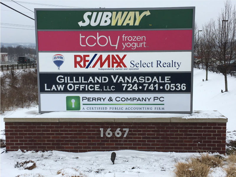
A pylon sign is built for a different problem: distance and elevation. When a business sits behind other buildings, at the back of a shopping plaza, or on a road with a grade change, a pylon sign raises identification well above eye level so it can be seen over parked cars, other signage, and landscaping. Businesses near highway exits, in dense retail corridors, or sharing a plaza with several other tenants typically need the height a pylon sign provides to stand out from the visual clutter around them.
Choosing between the two is really a site analysis question. We look at the actual sightlines from the roadway, the posted speed, the setback distance, and existing obstructions before recommending one structure over the other. A property with a short, clear frontage and a slower posted speed is often a strong candidate for a monument sign, while a property with obstructed sightlines or a shared multi-tenant pylon opportunity usually calls for the added height.
Contrast and Lighting Do the Work Color Alone Cannot
Color choice gets a lot of attention in sign design, but contrast is what actually determines legibility at a distance. Dark letters on a light background, or the reverse, read faster than color combinations with similar brightness values, even if the colors themselves look distinct up close. A driver’s eye is scanning quickly, and low-contrast combinations force extra processing time the driver simply does not have.
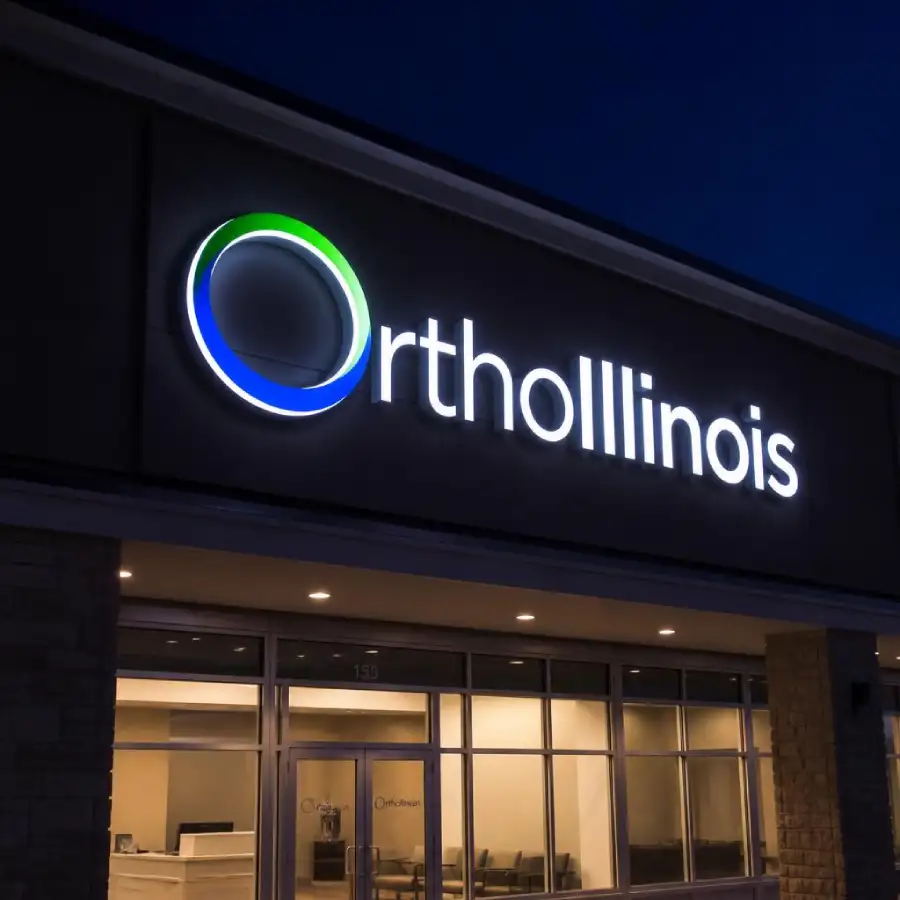
Nighttime visibility is its own category of problem. A property that reads clearly at 2 p.m. can become nearly invisible at 7 p.m. if the sign relies on ambient light rather than its own illumination. Internally illuminated cabinets, halo-lit letters, and properly aimed ground lighting extend a business’s visible hours to match when a meaningful share of its traffic is actually on the road, particularly for restaurants, urgent care clinics, and any retailer open into the evening.
What This Looks Like in Practice
We recently evaluated a corporate office set back nearly 300 feet from its access road, with a small building-mounted sign that had never been visible from the street. The building itself was well maintained and clearly branded up close, but nobody driving by knew a business was even there. The fix was not a bigger building sign. It was a monument sign positioned at the property line with letter heights sized to the actual approach speed on that road, which immediately restored visibility that had been missing since the building was constructed.
That is the core lesson behind roadside visibility. The building can be flawless and the branding can be exactly right, and none of it matters if a driver cannot process it in the three to five seconds available. Getting the site analysis right, matching the sign structure to the property’s actual constraints, and sizing letters to the real approach speed is what turns passing traffic into customers who actually stop.
The math behind that decision is worth taking seriously before ordering anything. A property owner who measures the actual sightline distance, checks the posted speed limit, and accounts for obstructions between the road and the building will almost always land on the correct structure and letter height on the first try, avoiding a costly second replacement later.

Frequently Asked Questions: Getting Your Business Noticed From the Road
How far away should my sign be readable?
As a general guide, plan for about 50 feet of legible distance for every 10 mph of posted speed on the adjacent road, which means a business on a 40 mph road needs a sign readable from roughly 200 feet away.
What is the difference between a monument sign and a pylon sign?
A monument sign is a low, ground-level structure best suited to properties with strong street frontage and a short setback, while a pylon sign is elevated on a pole to clear obstructions like other buildings, parked cars, or a shared plaza’s competing signage.
Does letter height matter more than overall sign size?
Yes. Legibility distance is driven primarily by letter height, with roughly 10 feet of readable distance per inch of letter height, so a sign can be visually large and still fail to read clearly from the road if the letters themselves are undersized.
Why does my business disappear at night even with a lit sign?
Ambient light from streetlights and neighboring businesses can wash out under-illuminated signage, so internally lit cabinets or halo-lit letters are usually necessary to maintain the same visibility after dark that the property has during the day.
Can landscaping actually block a sign that was fine when it was installed?
Yes, mature trees and shrubs are one of the most common causes of a sign losing its visibility over time, and a site walk every few years helps catch growth that is starting to obstruct sightlines from the road.
Is a bigger sign always the answer to a visibility problem?
Not necessarily. A site analysis often reveals that the real issue is placement, letter height, or contrast rather than overall size, and in some cases repositioning or re-lettering an existing structure solves the problem without a full replacement.